library(tidyverse) # For data wrangling
library(ggplot2) # Data visualization
library(readxl) # To read Excel files
library(kableExtra) # For data tables
library(ggplot2) # For data visualization
library(ggtext) # For formatting text in ggplot2
library(showtext) # For custom fonts in ggplot2
library(stringr) # For string manipulationA dot plot of public acceptability of domestic violence in Cambodia between 2005 and 2009
How to use {ggplot2} to create a dot plot to visualize changes over time
data visualization
domestic violence
Cambodia
ggplot2
Overview
According to official data from the National Institute of Statistics of Cambodia, in 2009 about 77 percent of Cambodians aged 15–49 considered it acceptable for a man to curse his wife. Although this figure is high, it represents a decrease of about 16 percentage points compared to the previous estimate from 2005. Analyzing these changes is important for gaining a better understanding of the phenomenon of violence against women and girls.
One of the most effective ways to visualize these changes over time is through dot plots. In this post, we will use the {ggplot2} package in R to create a dot plot that illustrates how public acceptance of domestic violence in Cambodia changed between 2005 and 2009.
Set-up
Load necessary libraries for data processing and visualization.
Loading data
Data comes from the report “Women and Men in Cambodia” produced by the National Institute of Statistics of the Ministry of Planning. This document provides insights into the situation of women and men in different spheres of life, including health, education, labour, decision making, and violence. The data used in this post is available in the table “Public Acceptability of Domestic Violence between 2005 and 2009” in section “VIOLENCE AGAINST WOMEN”. Report can be found here.
I extracted the data from the report and created an Excel file that can be found here
acceptability_violence <- read_excel("acceptability-violence-cambodia.xlsx")This information looks like this:
acceptability_violence |>
  kbl(
    caption = "Public Acceptability of Domestic Violence in Cambodia between 2005 and 2009"
    ) |>
kable_paper("hover", full_width = F)| Action | 2005 | 2009 |
|---|---|---|
| Cursing | 93 | 77 |
| Pushing, shaking, or throwing something | 74 | 46 |
| Knocking on the head | 69 | 36 |
| Tying up or hitting | 40 | 18 |
| Threatening with a knife gun or another weapon | 37 | 13 |
| Burning or choking | 24 | 10 |
| Throwing acid | 10 | 9 |
I use the pivot_longer() function in the {tidyverse} package to reshape the data to a long format, required for this plot.
acceptability_violence <- acceptability_violence |>
  pivot_longer(!Action, names_to = "Year", values_to = "Percentage")
Now the data looks like this:
acceptability_violence |>
  kbl(caption = "Public Acceptability of Domestic Violence in Cambodia between 2005 and 2009") |>
kable_paper("hover", full_width = F)| Action | Year | Percentage |
|---|---|---|
| Cursing | 2005 | 93 |
| Cursing | 2009 | 77 |
| Pushing, shaking, or throwing something | 2005 | 74 |
| Pushing, shaking, or throwing something | 2009 | 46 |
| Knocking on the head | 2005 | 69 |
| Knocking on the head | 2009 | 36 |
| Tying up or hitting | 2005 | 40 |
| Tying up or hitting | 2009 | 18 |
| Threatening with a knife gun or another weapon | 2005 | 37 |
| Threatening with a knife gun or another weapon | 2009 | 13 |
| Burning or choking | 2005 | 24 |
| Burning or choking | 2009 | 10 |
| Throwing acid | 2005 | 10 |
| Throwing acid | 2009 | 9 |
Dot plot design
I create a custom theme for the dot plot and apply the font “Jacques Francois”. More font alternatives can be found here.
# Add custom font
font_add_google("Jacques Francois", "Jacques Francois")

showtext_auto()

# Custom theme for the waffle chart
theme_dot_plot <- function() {
  theme_minimal(
    base_family = "Jacques Francois" # Base theme with custom font
  ) +
    # Custom theme settings
    theme(
      # remove grid lines
      panel.grid = element_line(
        size = 0.5,
        colour = "white"
        ),

      # Axis settings
      axis.line = element_blank(),

      axis.title.y = element_blank(),
      axis.text.y = element_text(
        color = "black",
        face = "bold",
        size = 16
      ),
      axis.title.x = element_text(
        color = "black",
        face = "bold",
        size = 16
      ),
      axis.text.x = element_text(
        color = "black",
        face = "bold",
        size = 16
      ),

      # Title settings
      plot.title.position = "plot", # Position of the title
      plot.title = element_text(
        color = "black",
        face = "bold",
        size = 24,
        margin = margin(5, 0, 5, 0) # Top, right, bottom, left
      ),

      # Subtitle settings
      plot.subtitle = element_text(
        color = "grey20",
        face = "italic",
        size = 20,
        margin = margin(0, 0, 10, 0)
        ),

      # Legend settings
      legend.position = "top",
      legend.title = element_blank(),
      legend.spacing.x = unit(0.2, "cm"),
      legend.key.spacing = unit(0.5, "cm"), # Spacing between legend keys
      legend.text = element_text(
        margin = margin(5, 2, 5, 0),
        face = "bold",
        color = "black",
        size = 16
      ),
      legend.direction = "horizontal",
      legend.byrow = FALSE,

      # Caption settings
      plot.caption = element_text(
        margin = margin(40, 0, 0, 0), # Top, right, bottom, left
        color = "black",
        size = 16
          ),
      plot.caption.position = "plot",

      plot.background = element_rect(
        color = "#FBB4AE",
        fill = "#FBB4AE"
      ),
      plot.margin = margin(20, 40, 20, 40)
    )
}

title_chart <- "Public acceptability of domestic violence in Cambodia"
subtitle_chart <- "Between 2005 and 2009, the share of people who tolerate violence has decreased"
caption_chart <- "Cambodia Key Gender Statistics, 2015 \nChart created by Juan Torres Munguía"

# Set the resolution of the image 320 dpi is for high-quality images ("retina")
showtext_opts(dpi = 320)
Finally, I create the dot plot using geom_line() and geom_point() functions from the {ggplto2} package.
dot_plot_acceptability <- acceptability_violence |>
  ggplot(
    aes(x = Percentage,
    y = Action)
    ) +
  geom_line(
    aes(group = Action),
    linewidth = 1.5,
    color = "#737373"
  ) +
  geom_point(
    aes(color = Year),
    size = 6
  ) +
  scale_colour_manual(
    values = c("#084081", "#2B8CBE")
    ) +
  labs(
    title = title_chart,
    subtitle = subtitle_chart,
    caption = caption_chart,
  ) +
  scale_x_continuous(
    limits = c(0, 100)
  ) +
  scale_y_discrete(
    # Wrap y-axis labels to a width of 32 characters
    labels = function(x) str_wrap(x, width = 32)
    ) +
  theme_dot_plot()
Finally, I export the plot using a 320-dpi resolution for high-quality (“retina”)
dot_plot_acceptabilityshowtext_opts(dpi = 320)
ggsave(
"cambodia-domestic-violence-dot-plot.png",
dpi = 320,
width = 12,
height = 9,
units = "in"
)
# Turn off the showtext functionality
showtext_auto(FALSE) 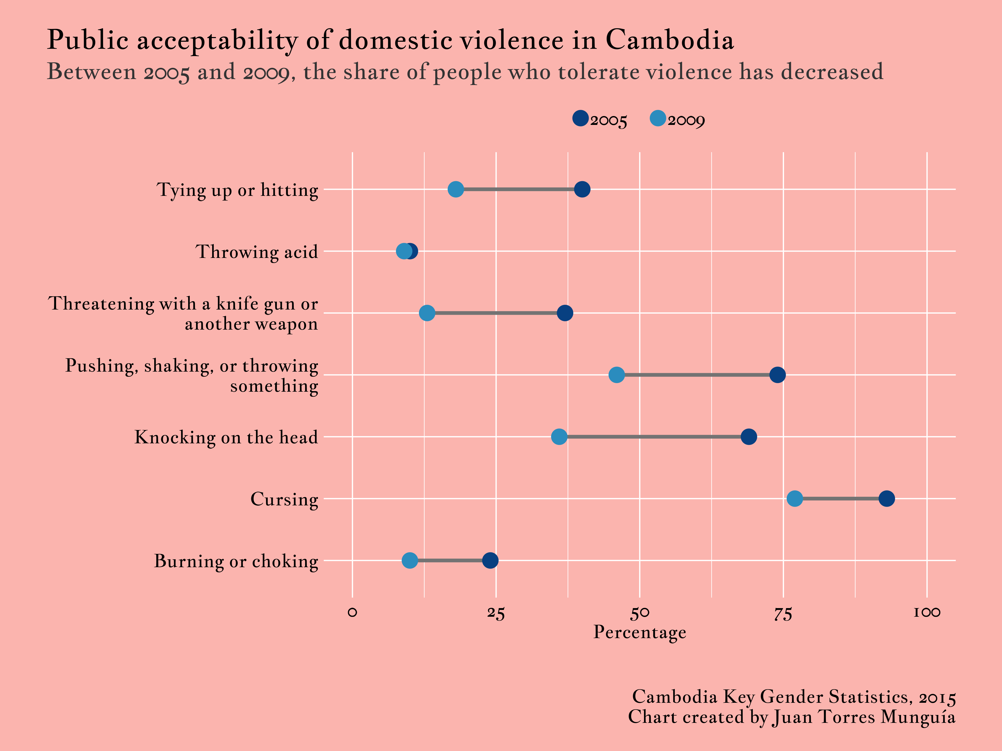
Citation
BibTeX citation:
@online{torres munguía2025,
  author = {Torres Munguía, Juan Armando},
  title = {A Dot Plot of Public Acceptability of Domestic Violence in
    {Cambodia} Between 2005 and 2009},
  date = {2025-06-18},
  url = {https://juan-torresmunguia.netlify.app/blog/posts/cambodia-acceptability-violence-dot-plot},
  langid = {en}
}
For attribution, please cite this work as:
Torres Munguía, Juan Armando. 2025. “A Dot Plot of Public
Acceptability of Domestic Violence in Cambodia Between 2005 and
2009.” June 18, 2025. https://juan-torresmunguia.netlify.app/blog/posts/cambodia-acceptability-violence-dot-plot.